Brand Guidelines
How to use these guidelines?
The following information will guide you through the proper usage of our brand. It will assist you in designing and producing compelling communications with consistency, creativity, and flexibility. Many of the standards set forth in this guide depend on size, proportion, and position. These have been developed through careful consideration of many factors, both functional and aesthetic. Adhering to these design standards will ensure that the #forestproud brand is always expressed clearly and with quality.
Our Logo
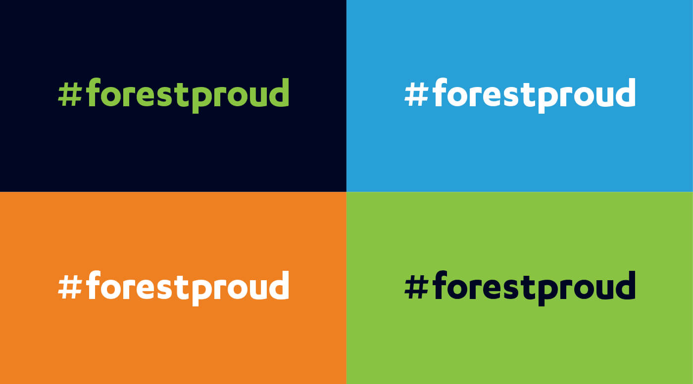
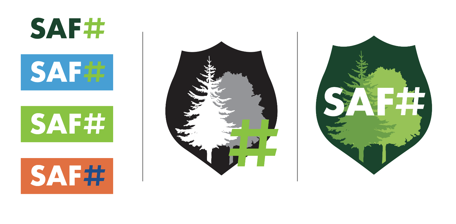
The #forestproud brand logo is the heart of our brand. It is a concise statement of what we stand for, and is the benchmark by which all communications moving forward should be measured. The logo has multiple color variations available. These variations ensure that the logo is visible on all backgrounds.
Color Palette
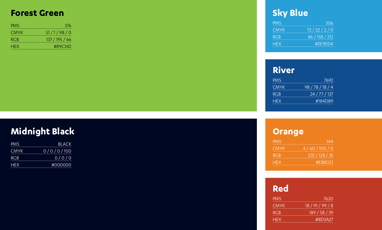
Consistent use of color is an important component of the visual branding and making #forestproud easily identifiable. The primary color palette consists of Forest Green and Black. Sky Blue, River, Orange, and Red are to be used as an accent colors that compliment the bolder primary color palette.
Typography
Consistent use of a brand font is another important component of a brand system. #forestproud’s brand font is Karbon (Bold for headlines), a contemporary sans serif font that compliments our logo, and adds the proper emphasis to our branding. Calibri Bold is an alternate.
Karbon Bold

Calibri Bold

Brand Display Fonts
RIG Outline

Abolition

Input Serif Condensed

Photography
As shown, #forestproud uses a set of different photo treatments. They are intended to add texture and visual interest, or to serve a specific purpose, for example to highlight a person or object, or create an interesting background for typography. Collectively they help to quickly recognize #forestproud materials.

Illustrations
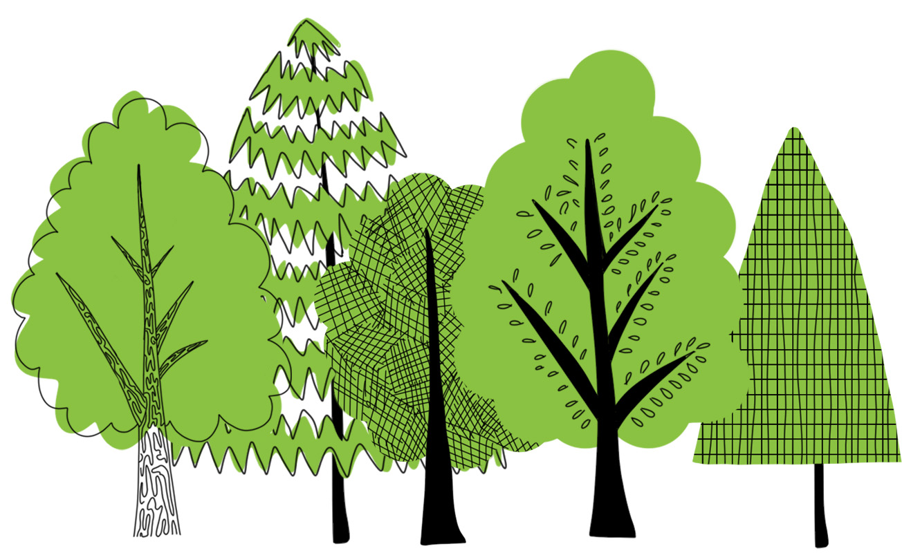
An important part of the the #forestproud visual library is a loose line-art illustration style, meant to show objects or concepts in a playful, eye-catching manner. These illustrations are always a single color line that either appears on a white background, or get’s knocked out of a color background. Color fill may be added to add weight and visual interest, define areas, but should always be done using flat colors.

SAF + #forestproud
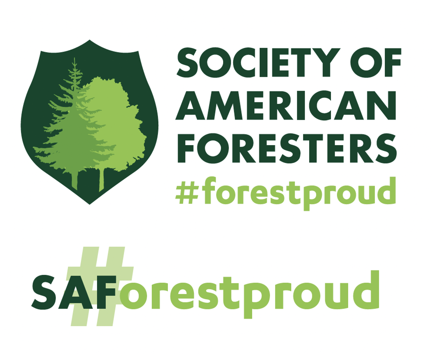
#forestproud is a brand powered by the Society of American Foresters. When appropriate and as established in partner SOWs and SOPs, there may be instances where the combined power of SAF + #forestproud is utilized for added authority, name recognition, and/or to convey the collaborative nature of a relationship between project partners, SAF as an entity, and #forestproud as a brand + communications vehicle.
These will be case-by-case creative decisions, and these logos below should be used only as a reference when considering projects and collaborations that may benefit from co-branding. Please reach out to the #forestproud brand manager or the SAF Communications team for questions: info@forestproud.org.
Contact us.
If you wish to obtain artwork or have any questions regarding how to handle the application of this identity, please contact Rae Tamblyn at rtamblyn@safnet.org.
